Network architecture diagrams are a great way to communicate your design, deployment, and topology. In this article we’ll focus on three online tools out there that allow you to create network diagrams (specifically cloud diagrams as they often require visualisation of various microservices). We’ll use a simple autoscaling example as our baseline reference for all our tool reviews, and compare the various outputs.
The diagramming tools we’ll be looking at are:
Evaluation criteria
We’ll be reviewing the diagramming tools above with a focus on:
- Basic notation
- Nodes to represent entities.
- Connectors to represent relationships between nodes.
- Groups to represent logical collections of entities (for example regions)
- Icon variety
- Visual style
- Ease of use
Excalidraw
Excalidraw is one of the easiest ways out there to visualise almost any idea. It has a simple toolbox that can be used to express a surprisingly wide range of concepts, whether it’s a network diagram, flow chart, or even a floorplan. Below is an example diagram produced using Excalidraw.

- Basic features: Excalidraw supports the three main diagramming tools (i.e. nodes, connectors and groups). It’s nice that connectors dynamically stick to nodes in most cases, which is handy when you come to rearranging nodes.
- Icon variety: Although Excalidraw doesn’t come with any icons out of the box, it has a searchable directory of community-made icon packs that you can download and start using in your diagrams straight away. As of now, searching for ‘network’ brings up 12 icon packs. You may need to do some vetting on icon packs to find one that suits your needs, but it is also possible to draw your own and create your own icon packs that you can reuse (for example, I drew the database icon above and reused it a few times in the same diagram).
- Visual style: Excalidraw has a very distinctive handrawn style, and even gives you controls for increasing the ‘sketchiness’ of your diagram. This style is not just for pleasing aesthetics though, it’s functional too as it actually helps your audience get into the mindset that they are looking at a rough idea that can change. This is especially useful for early-stage discussions and collaborative sketching.
- Ease of use: Excalidraw is fantastically easy to use. It supports real-time collaboration between teams, and a presentation mode.
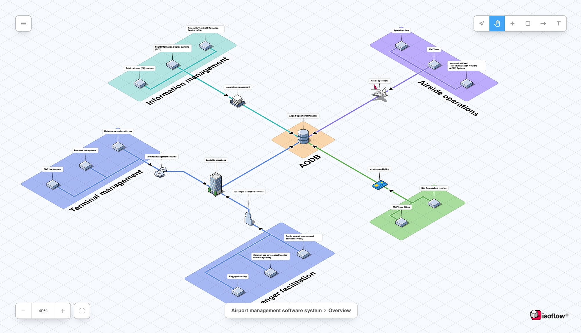
Isoflow
Isoflow is a more recent diagramming tool made solely for representing network diagrams. It has a 3D perspective which non-technical audiences may find more engaging and easier to read. Below is our network architecture example represented in Isoflow.

- Basic features: Like Excalidraw, Isoflow also supports the three main diagramming components you’d expect to see in a network diagramming tool. Connectors are also intelligent enough to attach to nodes so that they stay connected even when you move nodes around.
- Icon variety: Isoflow is made specifically for network diagrams, and so comes with a rich and well designed library of icons for representing networking concepts including servers, storage units, load balancers, VMs, and a few more. It also has a rich library for representing many cloud services provided by AWS, Azure and GCP.
- Visual style: Anyone who used to play games like Sim City or Command & Conquer will immediately recognise Isoflow’s game-inspired style. All elements are designed to fit in with the overall 3D aesthetic (for example, all the icons are the same size and are specifically designed to fit on the 3D grid). The consistency in its visuals can make technical concepts easier to digest when presenting to non-technical users.
- Ease of use: Isoflow implements a WYSIWIG drag and drop interface. Icons are easily searchable and it’s easy to annotate your diagram with labels.
Lucidchart
Lucidchart is probably the most popular of all the diagramming tools out there and caters to a wide range of diagram types including flow charts.

- Basic features: Lucidchart offers a lot of control over connectors, with the option to display them as curved lines (as I’ve drawn them above), or with right angles. Connector positioning can be a bit fiddly though when working with curves.
- Icon variety: Lucidchart has a wide range of icons. Like Isoflow, it has a searchable directory and includes icons from all the big cloud service providers. Some of the icons however don’t have consistent styling, for example the database icon looks more basic than the others.
- Visual style: Lucidchart is good for creating simple, readable diagrams. It’s output doesn’t have as much personality compared to Excalidraw or Isoflow, so it’s a safe bet for most audiences.
- Ease of use: Lucidchart is fairly easy to get to grips with. I made the diagram above in about 10 minutes without having any prior knowledge of its interface.
Conclusion
All the tools above are fairly easy to use and have notation features that allows you to express most network architecture concepts. The differentiator is in the visual style so it’s worth thinking about who your audience is. My opinions are below:
- Excalidraw: Best for quick sketches and early-stage diagrams.
- Isoflow: Best for marketing purposes and presenting to customers / non-technical audiences.
- Lucidchart: Best for technical audiences.
Do you have any network diagramming tools you’d like to see included in this post?
Leave a Reply